 الإنجليزية
 صمم موقعك الأن!
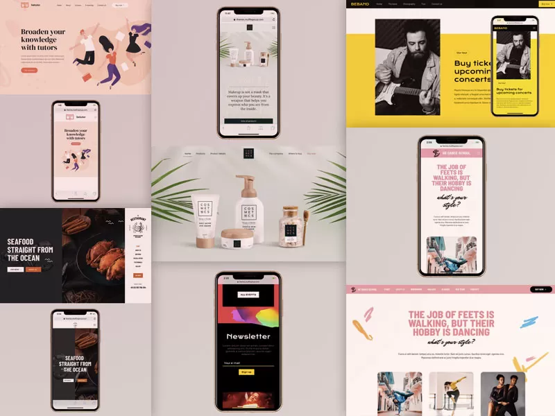
To design a website for mobile devices, start mobile-first: simplify navigation, use a responsive layout, compress images, choose readable font sizes (16px or more), make buttons easy to tap, avoid intrusive pop-ups, and test on real phones. Google indexes the mobile version of your site first, so mobile design directly affects rankings. Below are the eight steps plus mobile SEO best practices.
In today’s digital era, mobile devices have become an integral part of our daily lives. With more people accessing the internet via smartphones and tablets, it’s crucial for businesses to ensure their websites are optimized for mobile devices. In this comprehensive guide, we will explore how to design a website for mobile devices, ensuring it is user-friendly, visually appealing, and performs optimally across all screen sizes. We will also discuss the best practices and techniques to enhance mobile user experience and search engine optimization (SEO).
Recent statistics show a significant increase in mobile internet usage, with more users preferring smartphones for browsing. This shift necessitates that websites are designed to be mobile-friendly to cater to this growing audience.
A mobile-friendly website provides a seamless and enjoyable user experience. Ensuring that users can easily navigate, read, and interact with your website on their mobile devices leads to higher engagement and lower bounce rates.
Search engines like Google prioritize mobile-friendly websites in their rankings. Optimizing your website for mobile devices can significantly improve your visibility in search engine results, driving more organic traffic to your site.
The mobile-first approach involves designing the website initially for mobile devices and then adapting it for larger screens. This ensures that the essential elements and content are prioritized for mobile users.
Responsive web design is a technique that allows a website to adapt its layout and content based on the screen size and orientation of the device. By using flexible grids and media queries, you can create a responsive design that ensures your website looks great on any device.
Mobile users need an intuitive and straightforward navigation system. Use a hamburger menu or a simple dropdown menu to keep the navigation clean and easy to use. Ensure that important links and call-to-action buttons are easily accessible.
Large images and media files can slow down your website’s loading speed on mobile devices. Optimize images by compressing them and using the appropriate file formats. Consider using lazy loading to defer the loading of off-screen images until they are needed.
Ensure that the text on your website is readable on smaller screens by using legible fonts and appropriate font sizes. Avoid using too many different fonts, and maintain a consistent typography style throughout the site.
Design your website with touchscreens in mind. Make buttons and links large enough to be easily tapped with a finger. Ensure that there is enough spacing between interactive elements to prevent accidental clicks.
Pop-ups can be intrusive and frustrating for mobile users. Minimize their use or ensure they are easy to close on mobile devices. Consider using non-intrusive banners or in-line elements for important messages.
Testing your website across various mobile devices and browsers is crucial to identify any issues and ensure a consistent experience. Use tools like Google’s Mobile-Friendly Test and responsive design testing tools to check your site’s performance on different devices.
Planning a new website or improving your current one? We can review your needs and suggest the right approach. Book a free consultation on WhatsApp
Mobile users expect fast-loading websites. Optimize your website’s performance by minimizing HTTP requests, enabling browser caching, and compressing files. Tools like Google PageSpeed Insights can help you identify areas for improvement.
Ensure that your content is easily consumable on mobile devices. Use shorter paragraphs, bullet points, and headings to break up text. Optimize images and videos for mobile viewing and ensure they do not slow down your site.
Implementing schema markup can enhance your website’s appearance in search results and provide more information to search engines. Use structured data to highlight important information like business details, reviews, and events.
Mobile users often search for local businesses and services. Optimize your website for local SEO by including location-specific keywords, creating a Google My Business profile, and ensuring your contact information is consistent across all platforms.
Create a mobile sitemap to help search engines understand your website’s structure and index your pages correctly. Submit the mobile sitemap to search engines via their webmaster tools.
One of the biggest mistakes is neglecting mobile design altogether. Ensure that your website is designed with mobile users in mind from the outset.
Avoid cluttering your mobile site with too much content. Keep it concise and focus on delivering the most important information clearly and efficiently.
Slow-loading websites can frustrate users and lead to higher bounce rates. Regularly monitor your site’s performance and make necessary optimizations to maintain speed and responsiveness.
Consider developing a Progressive Web App (PWA) to provide a native app-like experience for mobile users. PWAs offer fast loading times, offline functionality, and can be added to the user’s home screen.
AMP is an open-source framework designed to make web pages load faster on mobile devices. Implementing AMP can improve your site’s loading speed and enhance user experience.
Incorporate mobile-specific features like click-to-call buttons, GPS-based directions, and integration with mobile wallets to enhance user convenience and engagement.
Use analytics tools like Google Analytics to track mobile user behavior on your site. Analyzing metrics such as bounce rates, session duration, and conversion rates can help you identify areas for improvement.
Conduct A/B testing to compare different design elements and identify what works best for your mobile audience. Experiment with variations in layout, content, and call-to-action buttons to optimize performance.
Understanding how to design a website for mobile devices is essential for businesses looking to succeed in the digital age. By adopting a mobile-first approach, using responsive design techniques, and following best practices for mobile SEO, you can create a website that offers a seamless and enjoyable experience for mobile users. For businesses seeking a reliable and professional partner in mobile web design, Sympaweb is the ideal choice. Contact Sympaweb today to embark on your journey towards a mobile-friendly and highly successful website.
Google primarily uses the mobile version of a page's content for indexing and ranking, so your mobile site must have the full content.
At least 16px for body text, with comfortable line height, so users do not need to zoom.
Intrusive interstitials that cover content can hurt rankings; small banners or delayed, easy-to-close prompts are safer.
At Sympaweb we design and develop fast, SEO-ready business websites and online stores for clients in Jordan, the Gulf and beyond.
Last updated: November 2026