The best fonts for web design are easy to read on screens at small sizes: clean sans-serifs such as Inter, Roboto, Open Sans and Lato for body text, with a distinctive font for headings if it suits your brand. For Arabic, Cairo, Tajawal, Almarai and IBM Plex Sans Arabic read well. Keep to two families, at least 16px for body text and comfortable line height. Below are the criteria and top picks.
When designing a website, one of the most crucial elements to consider is font choice. The right font can enhance user experience, improve readability, and contribute to the overall aesthetic appeal of your site. But what are the best fonts for web design and readability? This article explores the key factors that make fonts ideal for web use and highlights some of the top choices available.
The Importance of Font Selection in Web Design
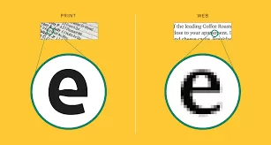
Font choice is more than just a design decision; it directly impacts how users interact with your content. A well-chosen font enhances readability, making your text easier to consume. On the other hand, poor font selection can drive users away, causing them to leave your site prematurely. Therefore, understanding what are the best fonts for web design and readability is essential for creating an effective and user-friendly website.
Characteristics of the Best Fonts for Web Design and Readability
When selecting a font for web design, consider the following characteristics:
- Legibility: The font should be easy to read, even at smaller sizes. Clear letterforms and adequate spacing between characters are crucial.
- Versatility: The font should work well in various sizes and weights. It should look good in both headlines and body text.
- Web-Safe Options: Choose fonts that are web-safe or easily accessible through Google Fonts or other web font services. This ensures consistent rendering across different browsers and devices.
- Neutrality: While decorative fonts can be appealing, they should be used sparingly. A neutral, simple font is usually best for body text to maintain readability.
- Brand Alignment: The font should align with your brand’s personality and message. For instance, a tech company might choose a modern, sans-serif font, while a luxury brand might opt for a more elegant serif font.
Planning a new website or improving your current one? We can review your needs and suggest the right approach. Book a free consultation on WhatsApp
Top Fonts for Web Design and Readability
Now that we’ve established what to look for, let’s dive into what are the best fonts for web design and readability:
- Roboto: A versatile and modern sans-serif font, Roboto is one of the most popular choices for web design. Its clean lines and excellent legibility make it ideal for both headlines and body text.
- Open Sans: Another top choice, Open Sans is known for its readability and neutrality. It works well in various contexts and is a favorite among designers for its flexibility.
- Lato: Lato offers a friendly and warm appearance, making it a great choice for websites that want to convey approachability. It’s highly legible and works well across different screen sizes.
- Merriweather: For those who prefer a serif font, Merriweather is a top contender. Designed specifically for readability on screens, it offers a classic look while maintaining clarity.
- Montserrat: Montserrat is a geometric sans-serif font that’s both stylish and highly legible. It’s a great option for modern websites looking to make a bold statement.
- Arial: A classic choice, Arial is one of the most widely used fonts on the web. Its simplicity and neutrality make it a safe bet for any website.
- Verdana: Verdana is specifically designed for screen readability. Its large x-height and wide spacing make it an excellent choice for body text.
- Georgia: Another serif option, Georgia is designed for optimal readability on screens. It’s a great choice for websites that want a more traditional look without sacrificing clarity.
Conclusion: What Are the Best Fonts for Web Design and Readability?
Choosing the right font is crucial for creating a successful website. By focusing on what are the best fonts for web design and readability, you can ensure that your site is both visually appealing and user-friendly. Whether you opt for a modern sans-serif like Roboto or a classic serif like Georgia, the key is to prioritize legibility and brand alignment.
Frequently asked questions
How many fonts should a website use?
Usually two: one for headings and one for body text, to keep the design consistent and pages fast.
What is the best font size for body text?
At least 16px, with line height around 1.5 to 1.7 for comfortable reading.
Which fonts work best for Arabic websites?
Cairo, Tajawal, Almarai, IBM Plex Sans Arabic and Noto Kufi Arabic are popular, readable choices.
Related articles
A professional website that brings clients
At Sympaweb we design and develop fast, SEO-ready business websites and online stores for clients in Jordan, the Gulf and beyond.
Get a free quote on WhatsApp
Last updated: November 2026
 Arabic
 Design Your Website Now!