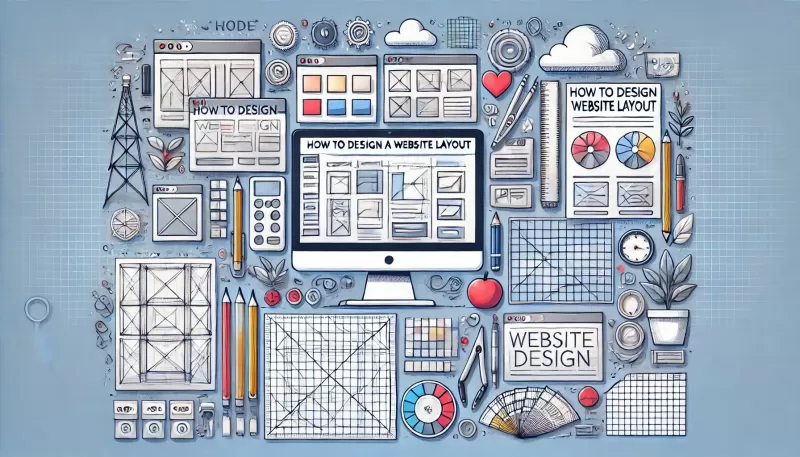
Creating an effective website layout is one of the most critical steps in building a successful online presence. Whether you are designing a personal blog, a business website, or an e-commerce platform, having a well-structured layout ensures that users can navigate your site easily, engage with your content, and take the desired actions. If you're wondering how to design a website layout, this detailed guide will walk you through the key steps to create a functional and visually appealing website.
1. Define Your Website’s Purpose and Goals
Before jumping into the design, it's essential to clarify what the primary purpose of your website is. Knowing your goals will shape the entire layout and structure.
- Is it an e-commerce site? Your focus should be on product pages, shopping carts, and easy checkout processes.
- Is it a blog? A clean, content-first layout with an easy-to-navigate archive is crucial.
- Is it a portfolio site? Showcasing images or media files with minimal distractions would be ideal.
Once you understand your website’s purpose, it becomes easier to structure your layout to align with your goals.
2. Plan the Website Structure and Navigation
A successful website layout relies on a logical structure and smooth navigation. Poor navigation can lead to user frustration and higher bounce rates. Here are key elements to consider when planning your website’s structure:
- Header and Navigation Bar: The header usually contains your logo and main navigation menu. The menu should be clear and easy to navigate, allowing users to find the pages they need quickly.
- Main Pages: List your essential pages, such as Home, About, Services, Blog, and Contact. Decide on their hierarchy and how they will be presented in the navigation bar.
- Footer: The footer is often overlooked but can include important links like privacy policies, social media links, and additional navigation.
3. Choose a Grid Layout for Consistency
Using a grid layout helps keep the design consistent and organized. Grids break down your webpage into columns and rows, allowing you to place content elements in a structured way. A well-thought-out grid makes the site look clean, professional, and balanced.
- 12-Column Grid: A common choice for website layouts, this allows flexibility in dividing the content into various sections.
- Responsive Grid: A grid system that adjusts based on the device size ensures that your website is mobile-friendly.
4. Focus on Visual Hierarchy
Visual hierarchy refers to the arrangement of elements in a way that directs the user's attention to the most important information first. When designing a website layout, prioritize content based on its importance:
- Headings: Use larger, bold fonts for headings to draw attention.
- Images and Icons: Place images strategically to guide users' eyes through the content.
- Call-to-Action (CTA): Highlight buttons like “Buy Now,” “Contact Us,” or “Sign Up” by using contrasting colors or prominent placement.
5. Incorporate White Space
White space (or negative space) is the area between elements on a webpage. It is essential for creating a clean, uncluttered look. White space improves readability and helps users focus on important elements like headings, text, and calls to action.
- Benefits of White Space: It enhances the visual hierarchy, reduces cognitive overload, and creates a modern and professional look.
- Where to Use White Space: Around images, buttons, text blocks, and between sections.
6. Ensure Responsive Design
With users accessing websites from various devices such as desktops, tablets, and smartphones, a responsive design is non-negotiable. A responsive layout adapts to different screen sizes and ensures that your content is accessible on all devices.
- Responsive Grid Systems: Use flexible grid layouts that automatically adjust to the user's screen size.
- Fluid Images and Text: Ensure that images and text can scale or wrap properly without breaking the layout on smaller screens.
- Test Responsiveness: Regularly test your layout on multiple devices to ensure optimal performance.
7. Prioritize User Experience (UX)
User experience is the backbone of effective web design. You want users to easily find what they’re looking for and feel satisfied while interacting with your site. Key factors that improve UX include:
- Fast Load Times: Optimize images, compress files, and minimize scripts to ensure the site loads quickly.
- Accessibility: Make your website accessible to all users, including those with disabilities, by following web accessibility guidelines (such as using alt text for images and providing keyboard navigation).
- Intuitive Navigation: Ensure that users can easily find what they’re looking for with intuitive navigation and internal links.
8. Optimize for SEO (Search Engine Optimization)
To attract visitors to your website, it’s crucial to design your layout with SEO in mind. A well-structured website layout can improve your search engine rankings and make it easier for users to find you.
- Headings Structure: Use H1, H2, and H3 headings in a logical hierarchy. The H1 tag should only appear once on a page, and it should describe the main topic of the page.
- Mobile-Friendly Design: Google prioritizes mobile-first indexing, so a responsive design is critical for SEO.
- Internal Linking: Link relevant pages within your website to improve navigation and boost SEO.
9. Select a Consistent Color Scheme
Your website's color scheme plays a crucial role in how users perceive your brand and interact with your content. Choosing the right color palette creates harmony and consistency across all pages.
- Primary Colors: Select 2-3 primary colors that represent your brand.
- Accent Colors: Use accent colors sparingly for CTA buttons, links, or highlights.
- Contrast: Ensure good contrast between text and background to improve readability.
10. Include High-Quality Media
Images, videos, and other media elements can enhance the overall user experience if used correctly. High-quality visuals attract attention, convey messages quickly, and break up large blocks of text.
- Optimized Images: Compress images without losing quality to improve load times.
- Relevant Videos: Embed videos that are relevant to your content and don’t autoplay unless necessary.
11. Test and Iterate
Once you’ve designed your website layout, it’s crucial to test it before launching. Testing helps identify any usability or performance issues.
- A/B Testing: Run A/B tests on different layout variations to determine which one performs better in terms of user engagement.
- User Testing: Ask users to navigate the site and provide feedback on the layout’s ease of use and functionality.
Conclusion
Designing a website layout involves careful planning and consideration of various elements such as structure, user experience, and responsiveness. By following these steps on how to design a website layout, you can create a professional, functional, and visually appealing site that meets your goals.
If you want the best results and need expert help in designing a website layout, contact us via WhatsApp for the best web design company to assist you in building a site that stands out.
 الإنجليزية
 صمم موقعك الأن!