 Arabic
 Design Your Website Now!
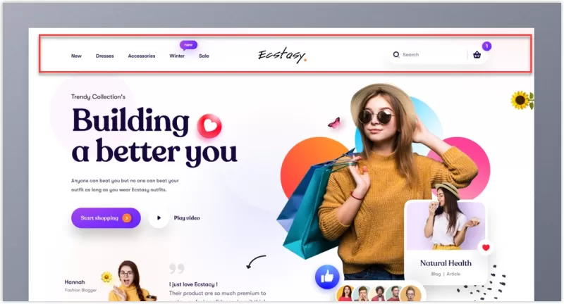
A good website header contains your logo (linked to the homepage), a short navigation menu of 5 to 7 items, one clear call-to-action button, and, where relevant, a search icon, language switcher, or cart. It must be responsive, collapse into a mobile menu, load fast, and stay visually consistent with your brand.
Creating a website header is one of the most critical elements in web design. The header serves as the first point of interaction between your website and its visitors, making it essential to design it thoughtfully. In this article, we'll guide you through the process of how to create a website header that not only captures attention but also enhances user experience. We'll also provide practical examples to illustrate these principles in action.
Before diving into the design, it's crucial to understand the purpose of your website header. Is it to showcase your brand, provide navigation, or promote a particular service? Knowing the goal will help you make informed design decisions that align with your overall website strategy.
Example: For an e-commerce site, the header might prioritize displaying a shopping cart icon and promotional banners, while a blog might emphasize a search bar and category links.
Your website header is an excellent place to establish brand identity. Include your logo, brand colors, and fonts to create a cohesive look. A well-branded header helps in building trust and recognition among your audience.
Example: A tech startup might use a sleek, modern logo with a minimalist color scheme, while a children's toy store could use playful fonts and bright colors.
A website header typically includes a navigation menu, guiding visitors to different sections of your site. Keep the navigation simple and intuitive. Use clear, concise labels and consider including a search bar for easy access to information.
Example: A travel blog might have a navigation menu with labels like "Destinations," "Travel Tips," "Gear Reviews," and "Contact," making it easy for visitors to find the information they need.
Including a call-to-action in your website header can encourage visitors to take specific actions, such as signing up for a newsletter, contacting you, or making a purchase. Make your CTA stand out with contrasting colors and compelling text.
Example: A subscription-based service might include a prominent "Start Your Free Trial" button in the header, using a bright color that contrasts with the rest of the design.
With the increasing use of mobile devices, ensuring your website header is responsive is vital. A mobile-friendly header should be clean, easy to navigate, and adaptable to different screen sizes. Test your design across various devices to ensure a seamless user experience.
Example: A responsive header might feature a hamburger menu on mobile devices, which expands to show navigation options, while maintaining the logo and key CTAs prominently.
Optimizing your website header for SEO can improve your site's visibility on search engines. Use relevant keywords, like "how to create a website header," and ensure your header loads quickly to enhance user experience and search engine rankings.
Example: An educational site might use keywords related to their content, such as "online courses," "tutorials," and "learning resources," integrated into the header and meta descriptions.
Once your header is designed and implemented, it's important to test its performance. Use analytics tools to track user interactions and make adjustments as needed. A/B testing can also help you determine which design elements are most effective.
Example: You might test different versions of your CTA button—changing the color, text, or placement—to see which one results in higher engagement.
<header> and <nav> element.On Arabic (RTL) sites the layout should be mirrored: logo on the right, menu flowing right to left. On bilingual sites, keep the language switcher visible in the header and make sure each language version links to its counterpart.
Want a header and website that convert visitors into customers? Talk to Sympaweb on WhatsApp
A logo, primary navigation, one call-to-action, and optionally search, language switcher, account, or cart icons.
Typically 60 to 100 pixels on desktop and smaller on mobile, so the main content stays visible.
A compact sticky header helps on long pages, but it should shrink on scroll and never cover too much of the screen.
Last updated: November 2026
Sympaweb designs fast, responsive, bilingual websites with headers and layouts built for conversions and SEO.